
Gosia Dzienisowicz - Product & Design Executive
I transform complex digital ecosystems—and build the design organizations that scale them.
Scaling a Pharmacy Experience Ecosystem
Building the framework, design system, and operating model for Walgreens' next-generation pharmacy software.
As Walgreens modernized its fragmented pharmacy technology ecosystem, individual applications couldn't be designed in isolation. I created and led an experience framework and shared design system that established how applications would navigate, behave, and feel—along with the governance and operating model needed to scale that experience across teams.
ROLE
Head of Design
SCOPE
Experience Strategy
Experience Architecture
Design Systems
Design Operations
Governance
ECOSYSTEM
Pharmacy Fulfillment
Supply Chain
Clinical Services
Assembly
Reporting
Administration
THE CHALLENGE
The organization worked in silos.
The pharmacy experience couldn't.
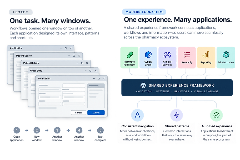
Walgreens’ legacy pharmacy technology had evolved over decades. Applications were developed independently, workflows opened window on top of window, interaction patterns varied, and even keyboard shortcuts for the same actions differed from one application to another.
As Walgreens began replacing this ecosystem with modern applications, the risk was clear: we could rebuild the same fragmentation with newer technology.
Business and Product teams naturally focused on their individual applications and capabilities. Because Design worked across the ecosystem, I had visibility into how those experiences connected—and where independently designed solutions would eventually collide.
Our challenge was to make independently developed applications behave like one connected system.
THE STRATEGY
Start with the architecture, not the interface.
The first problem wasn’t components or visual consistency. It was navigation.
The legacy pharmacy system relied on opening one window on top of another. As we moved toward a connected ecosystem of modern applications, we needed a new model for how users would move between applications, workflows and tasks—without losing context.
I partnered closely with the Product Lead and Enterprise Architect to define an experience framework that was desirable for users, aligned to the product strategy, and technically scalable.

The framework gave every team the same foundation before they designed a single screen.
DESIGNING FOR EXPERT USERS
Learn once. Use everywhere.
Pharmacists and pharmacy technicians were expert users working through high volumes of information and transactions. Speed mattered. Many relied primarily on the keyboard rather than a mouse.
The legacy applications supported shortcuts, but they had evolved independently. The same action could have a different shortcut depending on which application a user was in.
We created a shared interaction language across the pharmacy ecosystem—standardizing not only shortcuts, but how common actions and behaviors worked from one application to another.

KEYBOARD FIRST
Navigation and workflows were designed for expert users who relied heavily on keyboard interaction.
CONSISTENT SHORTCUTS
Common actions used the same shortcuts across applications instead of inheriting inconsistent legacy conventions.
PREDICTABLE BEHAVIORS
Tables, queues, forms, menus and task flows followed shared interaction patterns so users didn't have to relearn the interface.
Consistency meant challenging legacy familiarity.
Business teams sometimes wanted to preserve shortcuts from the applications they were replacing. While that reduced change within an individual workflow, it would have carried the fragmentation of the legacy ecosystem into the new platform.
I had to shift the conversation from preserving what was familiar within one application to creating what was learnable across the entire ecosystem.
Consistency wasn't cosmetic. It reduced what expert users had to learn and remember.
FROM FRAMEWORK TO SYSTEM
Turning experience decisions into a reusable system.
The experience framework established the principles. I translated those principles into a shared enterprise design system that gave designers and engineers reusable guidance for building consistent pharmacy experiences.
For complex, data-heavy applications, the system went beyond visual components. It defined how recurring workflows, data interactions, system feedback and common behaviors should work across the ecosystem.
WORKFLOWS
How users move through forms, queues, multi-step tasks, contextual workflows and interrupted work.
DATA INTERACTIONS
How tables, lists, filtering, selection, validation and large amounts of operational information behave.
SYSTEM FEEDBACK
When to inform, warn, require acknowledgement or stop a user from proceeding.
COMPONENTS
Reusable UI elements with defined states, accessibility, keyboard behavior and implementation guidance.
The design system didn't just define how the software looked. It established how pharmacy work behaved.
* Illustrative representation of the design-system documentation. Original artifacts contain proprietary information and are not shown.

SCALING THE SYSTEM
Then the challenge became scale.
The framework and design system were already underway when Walgreens outsourced a significant portion of software development and design.
Almost overnight, the design organization expanded from roughly 15–20 designers to nearly 70—many joining teams already responsible for different parts of the pharmacy ecosystem.
I suddenly had designers with different backgrounds, methods, and levels of experience contributing to products that still needed to behave like one connected system.
The framework and design system became more than a consistency tool. They became the infrastructure for scaling the design organization.

ONBOARD
Give incoming designers a common foundation for understanding how pharmacy experiences worked.
ENABLE
Provide reusable patterns, guidance and design assets so teams didn't have to solve the same problems repeatedly.
ALIGN
Create shared boundaries that allowed many teams to design independently without fragmenting the ecosystem.
The challenge was no longer just designing the system. It was enabling 70 designers to use it consistently.
DESIGN GOVERNANCE
Scaling without creating a bottleneck.
With nearly 70 designers working across multiple pharmacy products, the design system couldn't depend on one person reviewing every screen.
I established a governance model that distributed ownership while protecting the integrity of the overall experience.
Domain Design Leads owned the quality of screens and workflows within their product areas. A cross-domain Design System team maintained and evolved shared patterns. I owned the system-level experience architecture and governance, including final approval of additions to the system.
When teams encountered a requirement the system didn't support, they brought it into an open bi-weekly design-system review. Sometimes the solution already existed. When it didn't, we evaluated whether the need should become a shared pattern or remain specific to that domain.

Governance wasn’t enforcement. It was alignment.
IMPACT
When Engineering started asking for the system.
The design system began as a Design-led effort to create consistency across a fragmented pharmacy ecosystem. Early on, part of my role was convincing Engineering that shared patterns and reusable components would help teams build products faster and more predictably.
Over time, that changed.
As teams began designing and building with the system, its value became visible. Designers spent less time reinventing solutions. Engineers could reuse established components. And in sprint demos, we could immediately see the difference between experiences built with the shared system and those built independently.
Years later, when the organization began consolidating design systems, Pharmacy Engineering advocated for continuing to use the system because it supported the specialized workflows their teams needed.
DESIGN FASTER
Reuse established patterns instead of reinventing solutions.
BUILD FASTER
Reusable components accelerated implementation.
GREATER CONSISTENCY
Applications built by different teams behaved as one ecosystem.
TRANSFER LEARNING
Users carried familiar behaviors and shortcuts across applications.
The strongest measure of adoption wasn't that Design required the system.
It was that Engineering started asking for it.
I wasn't designing a collection of products. I was designing the system that enabled teams to design and build them coherently at scale.